
Colour Theory for Makeup Artists: the wheel, complements, warm and cool
Colour theory is the set of rules that predicts what happens when one colour sits on or beside another. For a makeup artist it answers the questions that otherwise cost years of trial and error: which corrector cancels a dark circle, why a blush that looks fresh on one client looks muddy on the next, why a lipstick that is orange in the tube reads brown on the lips. Everything in this guide is practical; nothing is theory for its own sake.
The wheel makeup artists use
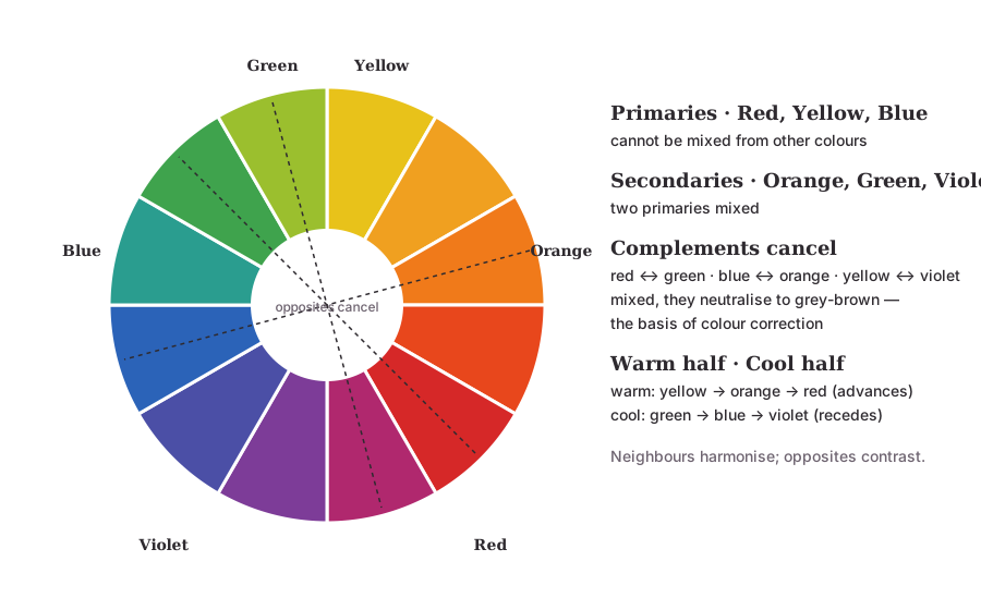
Makeup uses the pigment wheel, with red, yellow and blue as primaries — the three colours that cannot be mixed from anything else. Mixing two primaries gives the secondaries: orange, green and violet. Mixing a primary with its neighbouring secondary gives the tertiaries: red-orange, yellow-orange, yellow-green, blue-green, blue-violet, red-violet. Twelve segments; every pigment an artist owns sits somewhere on it or is a muted, lightened or darkened version of a segment.
Screens use red, green and blue light and printers use cyan, magenta and yellow ink; those wheels are for other trades. Pigments on skin mix the way paint mixes, and the RYB wheel predicts that correctly.
Three properties of every colour
- Hue — where the colour sits on the wheel: red, blue-green, yellow-orange.
- Value — how light or dark it is. Adding white raises value (a tint); adding black lowers it (a shade). A contour is the skin's hue at a lower value.
- Intensity (saturation) — how pure or muted it is. Adding a colour's complement, or grey, mutes it. A "nude" lipstick is the lip's own hue at low intensity; a bridal red is the same hue at full intensity.
Most "this looks wrong" moments are a value or intensity problem, not a hue problem: the blush was right in hue but too saturated for the skin; the contour was the right brown but too dark.
Complementary colours: why correction works
Colours directly opposite on the wheel are complements: red and green, yellow and violet, blue and orange, and the tertiary pairs between. Mixed in the right proportion, complements cancel each other to a neutral grey-brown.
That cancelling is the whole basis of colour correction. Redness is red; a sheer green corrector neutralises it. A dark circle on lighter skin is blue-violet; peach (yellow-orange) neutralises it. On deeper skin the shadow is bluer and the skin more golden, so a deeper orange is the complement. Sallow, yellow skin is neutralised by lavender (violet). The corrector is the complement of the problem, at a strength matched to it — which is Colour Correction Explained in one sentence.
Warm and cool
Draw a line through the wheel from yellow-green to red-violet. One half — yellow, orange, red — is warm; the other — green, blue, violet — is cool. Warm colours seem to come forward; cool colours seem to recede. That is why a cool-toned contour reads as a shadow and a warm bronzer reads as sun on a high point, and why undertone — the skin's own lean toward the warm or cool half — governs every match. Read Skin Undertone Explained for the skin side of this.
Every product has a temperature too. A red lipstick can be orange-red (warm) or blue-red (cool); a "brown" eyeshadow can be warm caramel or cool taupe; a pink blush can be peach-pink or blue-pink. Matching the product's temperature to the skin's is what makes a colour look like it belongs.
Harmonies: which colours sit well together
- Monochromatic: one hue at different values and intensities — a rose blush, rose lip and soft rose eye. Safe and elegant; the classic soft-glam bridal formula.
- Analogous: neighbours on the wheel — copper, bronze and warm brown; or mauve, plum and berry. Rich and harmonious.
- Complementary: opposites — a bronze eye with a blue-green liner, a warm orange-red lip against a green outfit. High contrast; use one as the accent, not both at full strength.
- Split complementary and triadic: editorial territory — for a bride, usually one accent against a harmonious base.
The eye reads the outfit and jewellery as part of the palette. A bride in emerald with gold jewellery is already wearing a complementary pair; the makeup's job is to sit inside that harmony, not add a third statement.
Colour theory on Indian skin
Most Indian skin sits in the warm and olive families with medium-to-deep values. Three things follow:
- Muted is the friend of depth. Highly saturated pastels can look chalky on medium and deep skin; the same hue at higher intensity and slightly lower value (a deeper coral instead of a pale peach) reads as fresh.
- Cool greys and taupes go ashy. On warm and olive skin, contour and "neutral" shadows need a touch of warmth or they turn grey.
- Warm reds and berries both work — for different undertones. Warm skin takes brick, orange-red and warm berry; cool-leaning skin takes blue-red and plum; olive skin takes brick and brown-red and is muddied by cool mauve.
Common mistakes
- Correcting with a colour that is not the complement — yellow on redness, green on a dark circle.
- Choosing blush by name ("pink") rather than by temperature (peach-pink vs blue-pink).
- Matching hue but ignoring value: a contour in the right brown at the wrong darkness.
- Pastel eyeshadows at full saturation on deep skin.
- Treating the outfit as separate from the palette.
From Chhaya Yadav's experience
Observations from bridal work and teaching in Jaipur — professional observations, not statistics.
- Every bridal consultation is a colour-theory exercise, whether the bride knows it or not. The lehenga, the jewellery, the venue lighting and her undertone are the palette; the makeup is chosen to sit inside it.
- Students memorise the wheel and forget value. The commonest classroom error is the right hue at the wrong depth — a perfect brown contour that is two steps too dark.
- On warm and olive skin, the "cool contour" rule needs a footnote. Cooler than the skin, yes; grey, no. A neutral brown does the job that a grey-taupe cannot.
- Red is not one colour. Half the "I can't wear red" conversations end when the bride tries a red of the other temperature.
Frequently asked questions
Why do makeup artists need colour theory? Because every choice is a colour choice: which corrector cancels a dark circle, why a blush looks muddy on one skin and fresh on another, why a lipstick reads orange in the tube and brown on the lips. The wheel explains all of it in advance instead of by trial and error.
What are complementary colours in makeup? Colours opposite each other on the wheel — red and green, blue and orange, yellow and violet. Mixed, they cancel to a neutral grey-brown. That cancelling is what colour correction relies on: green neutralises redness, orange neutralises blue-purple shadows.
What is the difference between warm and cool colours? Warm colours lean toward yellow, orange and red; cool colours lean toward blue, violet and green. Skin, blush, eyeshadow and lipstick all have a temperature, and matching temperatures is why some combinations look harmonious and others look off.
What are value and intensity? Value is how light or dark a colour is; intensity (saturation) is how pure or muted it is. A contour is a low-value, low-intensity version of the skin's colour; a bridal red lip is a high-intensity red; a "nude" is a low-intensity version of the lip's own colour.
Which colour wheel do makeup artists use? The traditional pigment wheel with red, yellow and blue as primaries. It matches how pigments behave when mixed on skin — which is what an artist does — even though screens and printers use different primaries.
Key takeaways
- The pigment wheel (red, yellow, blue) predicts how makeup colours mix and sit together.
- Hue, value and intensity — most mistakes are value or intensity, not hue.
- Complements cancel; that is colour correction.
- Warm advances, cool recedes; match the product's temperature to the skin's undertone.
- On Indian skin: muted saturation for depth, warmth in the neutrals, and the right temperature of red.
Related reading
- Colour Correction Explained — complements put to work
- Skin Undertone Explained — the skin's own temperature
- What is Contouring? — value and temperature in practice
- Professional makeup courses at the academy
- About Chhaya Yadav