
Colour Correction Explained: green, orange, peach, lavender and yellow correctors
Colour correction is neutralising a discolouration with its complementary colour before foundation goes on. Green cancels red; peach and orange cancel the blue-violet of a dark circle; yellow cancels purple; lavender cancels yellow-sallow tones. Done right, it lets the foundation stay thin — which is the whole reason it exists. Done wrong, it leaves grey patches and a heavy base. This guide gives the corrector-to-problem map by skin depth, the amounts, the order, and the mistakes.
For the underlying rule — complements cancel — read Colour Theory for Makeup Artists.
Why correct instead of cover
Foundation adds a layer of matched colour. Over strong redness or a deep circle, a thin layer is not enough and a thick one looks like a mask. A corrector attacks the discolouration's hue: the red is cancelled toward neutral, so the foundation only has to even a neutral surface, and it can do that in a thin layer. Less product, better photographs, longer wear.
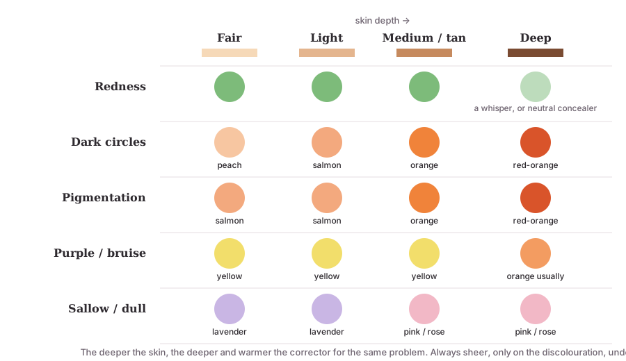
The corrector map
| Corrector | Cancels | Typical use | Skin depth |
|---|---|---|---|
| Green | Red | Redness around the nose, acne marks, rosacea, a healing blemish | All depths, sheerly |
| Peach | Blue-violet | Dark under-eye circles, faint hyperpigmentation | Fair to light |
| Salmon / deep peach | Blue-violet, some brown | Dark circles, mild pigmentation | Light to medium |
| Orange | Blue, blue-grey | Deep under-eye circles, dark spots, pigmentation | Tan to deep |
| Red-orange / red | Blue-grey, ashy greyness | Very deep circles and hyperpigmentation | Deep to very deep |
| Yellow | Purple | Bruising, purple veins, purple-toned circles; brightening | Fair to medium (and as a brightener on some deeper skins) |
| Lavender | Yellow, sallow | Dull, yellow-toned areas; sallowness | Fair to light; rarely needed on deep skin |
| Pink / rose | Grey, dullness | Brightening tired, grey-toned areas | Fair to light |
The rule under the table: the deeper the skin, the deeper and warmer the corrector for the same problem, because both the shadow and the skin's own colour are deeper. Peach on deep skin does nothing; orange on fair skin shows as an orange patch.
How much, and how
- Skin prep and primer first, if used.
- Sheer layer. A corrector is a tint, not a paint. Tap a small amount with a fingertip or a small synthetic brush only over the discoloured area — not the whole under-eye, just the dark crescent.
- Press, do not rub. Rubbing spreads the corrector beyond the problem and lifts it.
- Let it set for a minute.
- Foundation over it in thin passes, pressed rather than swiped, so the corrector stays where it was put.
- Concealer only if needed, a shade matched to the skin, again thin.
- Check in daylight and under flash. A grey shadow means too much corrector or too little foundation.
Cream correctors sit in the skin and suit most work; liquid correctors are sheerer and easier to over-apply; powder correctors are for light brightening over a set base.
By problem
- Redness (nose, cheeks, blemishes): green, sheer. On deep skin even less — a whisper — or a neutral concealer instead; green on deep skin shows quickly.
- Dark under-eye circles: by depth — peach → salmon → orange → red-orange. Apply on the dark area only, not up to the lash line, not across the whole socket.
- Hyperpigmentation and dark spots: orange or red-orange on medium-to-deep skin; salmon on lighter skin; then concealer.
- Purple veins, bruising, a purple-toned circle: yellow.
- Sallow, dull, yellow-toned skin: lavender on fair-to-light; on medium and deep skin, a pink or rose brightener usually does more than lavender.
- Grey, tired areas (fair skin): pink or rose.
- Post-haldi or turmeric staining: the stain is yellow-orange; a sheer lavender or a cool-toned concealer neutralises it before foundation.
Common mistakes
- Too much. The commonest fault by far. A corrector that is visible after foundation was applied too heavily.
- Wrong depth of corrector. Peach on deep skin (does nothing); orange on fair skin (orange patch).
- Corrector everywhere. Under the whole eye, across the whole cheek — instead of on the discolouration only.
- Over foundation. It shows as a coloured patch.
- Rubbing. Spreads and lifts.
- Correcting texture. A raised or pitted mark has no colour to cancel; correction cannot flatten it.
From Chhaya Yadav's experience
Observations from bridal work and teaching in Jaipur — professional observations, not statistics.
- Most of my brides need orange, not peach. On warm and olive medium-to-deep skin the under-eye is blue-grey and the skin golden; peach vanishes and orange or a red-orange is what actually neutralises it.
- Green turns grey the moment the base is thin. Students apply green generously "to be safe" and then a thin HD base cannot cover it. A whisper of green and a slightly fuller press of foundation over that one area is the fix.
- The haldi morning. A bride who has had haldi the day before arrives with a yellow-orange cast on the cheeks and forehead; a sheer lavender under the base evens it without going heavy.
- Correct less, conceal less, photograph better. Almost every time I strip a student's correction back to half, the flash photo improves.
Frequently asked questions
What is colour correction in makeup? Neutralising a discolouration with its complementary colour before foundation, so the foundation can be thin. Green cancels red, peach or orange cancels blue-purple shadows, yellow cancels purple, lavender cancels yellow-sallow tones.
Which corrector is best for dark circles? It depends on skin depth. On fair-to-light skin the circle is blue-violet and peach cancels it. On medium skin, a deeper peach or salmon. On tan-to-deep skin the shadow is bluer and the skin more golden, so orange — sometimes red-orange — is the complement.
Do I need colour corrector every day? No. It is for discolouration that foundation alone cannot even without going heavy. Mild redness or faint circles are handled by a medium-coverage foundation and concealer. Correctors earn their place on strong redness, deep circles, hyperpigmentation and for photography.
Does corrector go under or over foundation? Under. A thin layer of corrector, pressed in and allowed to set, then foundation over it in thin layers. Corrector over foundation shows as a coloured patch.
Why does my green corrector look grey? Too much of it, or too little foundation over it. Green cancels red to a neutral; if there is more green than red, the result is grey. Use a sheer layer and build foundation over it in thin passes.
Can colour correction hide pigmentation completely? It reduces the contrast so foundation and concealer can finish the job thinly. Deep, raised or textured pigmentation will still show slightly under close inspection; the aim is even colour in photographs and at conversational distance, not invisibility under a magnifier.
Key takeaways
- A corrector is the complement of the problem: green for red, peach/orange for blue-violet, yellow for purple, lavender for sallow.
- Choose depth by skin depth: peach on fair, salmon on medium, orange and red-orange on deep.
- Sheer, on the discolouration only, pressed not rubbed, set, then thin foundation over.
- Too much is the commonest mistake; grey is the sign.
- Correction fixes colour, never texture.
Related reading
- Colour Theory for Makeup Artists — why complements cancel
- Skin Undertone Explained — reading the skin's own colour
- How to Choose the Correct Foundation Shade — the base that goes over the correction
- What is HD Makeup? — why the base must stay thin
- Professional makeup courses at the academy
- About Chhaya Yadav